Adobe Illustrator is a vector-based creation software that is mostly used for making vector art, design mock-ups, animation elements, etc. As it is with any Adobe software (or any professional software), things are complicated and the learning curve is a bit steep. But this Illustrator typography trick is not difficult to learn and does not take too much time.
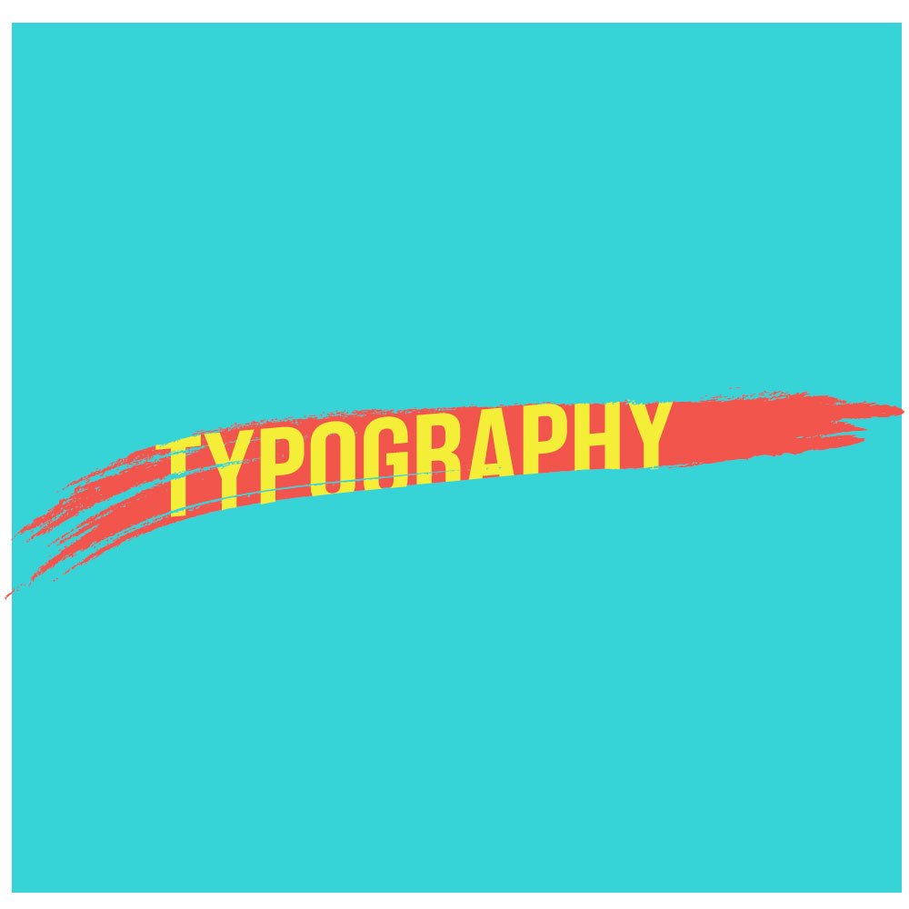
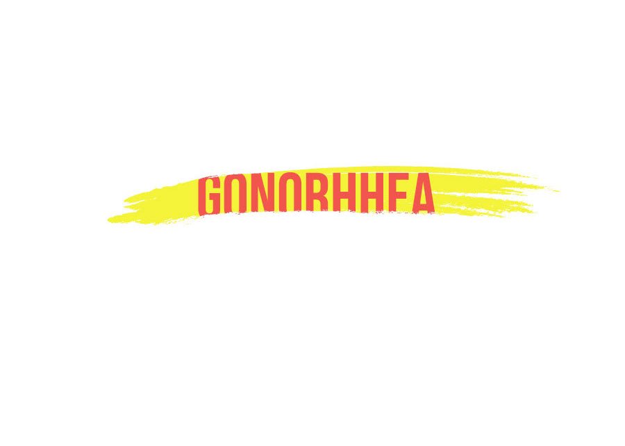
You can see from the cover image and the images that will serve as examples of what you can do with this little trick. Instead of using simple, plain texts, you can use this way of typing to add a little favor and another dimension to your illustrative art.
The best thing about this trick is that it isn’t restricted to my ways. You can use your creativity and style to make it exactly how you want it to. All you need is some resources which I’ll mention later. No need for any plugins, art, vectors, textures. All you need is Adobe Illustrator. Let’s begin.
Tools needed.
This tutorial will only require you to use them;
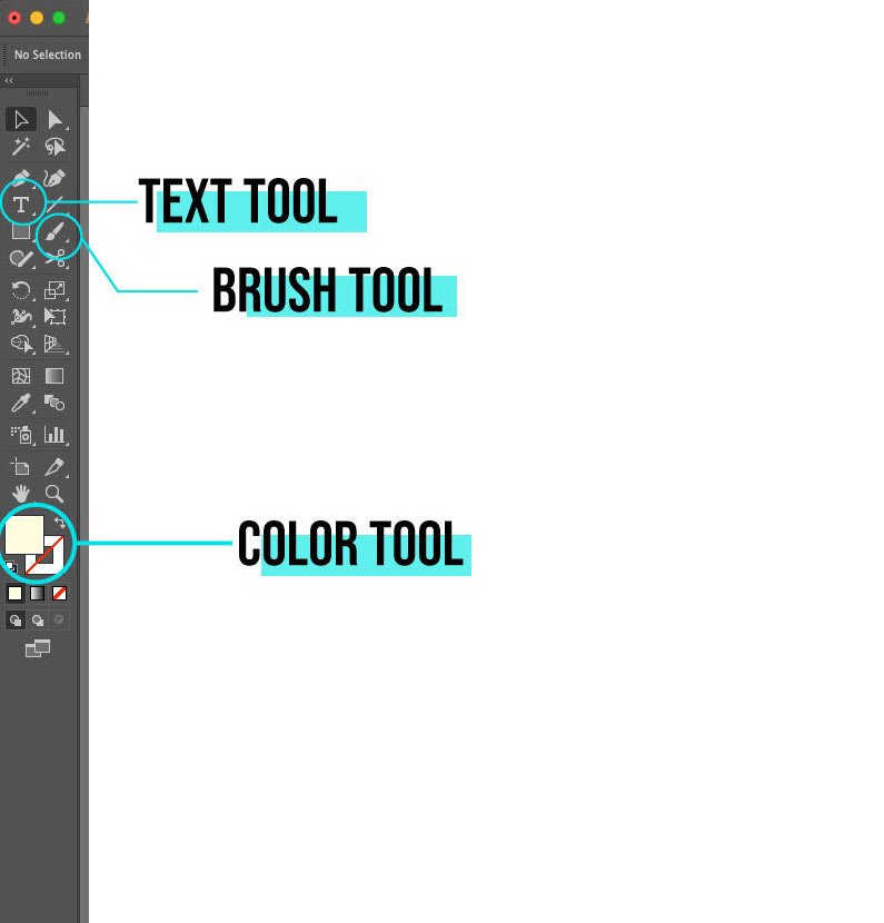
- Text tool
- Brush tool
- Color tool
- Object >> Expand
- Pathfinder >> Divide.

If you have no idea what these tools do, don’t worry, I’ll explain them briefly as we come to their use. Let’s begin with a plain, white background of 1000 x 1000 pixels and RGB color profile. Remember, for digital screens, always use RGB color and for printing (if you intend to print the artwork) use CMYK.
Creating a Text
Use the text tool from the toolbar. The icon has “T” written over it, or you can press the “T” key on your keyboard for both macOS and Windows. Write a text. I’ll write the word “typography” since it is long and the effect will look better. You can use shorter words as well.
It is also recommended that you write it in all caps. This is because it enhances visibility. You’ll understand this more clearly in the latter part of the tutorial. I have used the font Bebas Neue. You can get it for free from Google fonts. The font is bold, thick, and well-spaced, perfect for editing.
Creating the capsule
Now we have to make an encompassing element where the text will be placed. You are free to use any shape, stroke, or even texts to make the capsule. The capsule is the place where your text will sit.
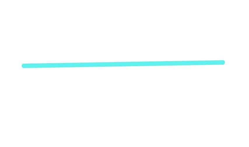
The brush stroke – To make the capsule, I have used the brush stroke. Select the brush from the toolbar or simply press the “B” key on your keyboard. Now make a long line that is slightly longer than the word (typography, in this case).
Change the brush stroke
The brush stroke is just a straight, thin line and there’s no way it can act as a capsule for our text. Don’t worry. We’ll transform it into something different which you can use it, even independently.
Select the brush line that you just created and then look at the right side of the panel. You can see the “brushes” panel with different types of lines. If you cannot see it, go to Window>>Brushes. You can also press “F5” to toggle the brushes menu for macOS and Windows.

Select the brush libraries menu as shown in the picture. You can select any stoke you like from the menu (you can also download brushes from websites). I’ll be using Vector >> Grunge brushes.
Now the thin line has transformed into a brushstroke that looks better. It will serve as the capsule. Adjust the thickness and size of the stroke to make it a little bit thinner and smaller than the text. Place the stroke above the text as shown.
An important task is to change the color of the stroke and the text (using contrasting colors, like yellow and red). Send the brush stroke behind the text. To do that, select the brushstroke, right-click on it >> Arrange >> Send to Back. You can also use the shortcut “Shift+Command+[” or “Shift+Control+[”
Articles related to Adobe Illustrator:
- How to use clipping mask in Adobe Illustrator
- Cropping trick in Adobe Illustrator to crop in any shape you want
Using the Pathfinder tool
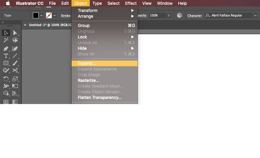
Before you use the pathfinder tool, there are a few things you need to before that. First, select the brush stroke and then go to Objects >> Expand Appearance. This will make the brush stroke a vector.
The next thing you need to do is change the text into a vector object. Remember, the text cannot be edited unless it is turned into an object. To do this, select the text using the selection tool (V). NOTE– Everything before this must be selected using the selection tool. Right-click on the text and select create outlines.
You’ve turned the text into a vector-based object. Now comes the pathfinder time.
The divide function of the pathfinder tool is used to separate the intersecting points of two vectors. Although the pathfinder has many uses, we shall focus only on this one.
To use the divide function, select both the text and the brush stroke. Then click on the pathfinder icon on the right panel or from Window>>Pathfinder. You can also press Shift + Command + F9 (Control instead of command in windows) to toggle it.

With both the text and the brush stroke selected, click on the divide icon as shown in the image. You have divided the objects. Let’s move to the clearing part.
Select the direct selection tool that is right next to the selection tool in the toolbar. You can also press the “A” key on the keyboard. This tool is used for individual elements of a complex vector. You can also ungroup the whole thing and use the selection tool but that would be complicating the process.
Zoom closely to the vector and then start selecting the parts of the text that are out of the brush stroke. You’ll notice that the selected part will be separated from the main text. Once selected, press the delete button to remove it.
Repeat the process until you have removed all the protruding text and you get a clean vector of text encapsulated inside the brush stroke. This looks much more professional and unique and it does not take that much effort.
Make multiple designs
You should not be limited to just brush strokes. You can use pretty much anything (vector) to use it as the capsule and place the text inside. Just make sure that the text is slightly bigger than the capsule or else it won’t bring out the encapsulated effect.
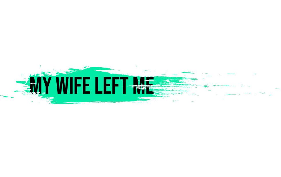
Here are some other images I have made using different elements to achieve the same effect. You won’t find it difficult to understand how I made these since you understand the basics of it. A little detailing has been added to polish the look.
All you need is some great color palette which you can choose from colorhunt.co or any place. I use Behance as well to find some great color palette from talented artists.
This was all about this little trick. Keep experimenting and you’ll get better in making more complex typography designs, just in few simple steps. Till then, keep creating.