
Adobe Illustrator is a great software for making vector-based art, be it realistic illustration or flat, minimal designs. From UI mockups to app-layout design. But you may have noticed one thing when you are beginning to make basic designs on Illustrator; they look very basic and simple. This is why we’re presenting Adobe Illustrator texture tutorial.
The texture feature in Illustrator is a great way of automatically adding an extra dimension to your simple designs. The feature in itself is not very helpful. And if you were to merely apply the texture (which also has many types, this article will focus on grain), the vector won’t look that great.
There are multiple features of the texture function. It has craquelure which is the effect of cracks on a painted surface. It has a grain that adds noise and texture. And it has mosaic tiles and patchwork which work exactly as they are termed. Finally, it has stained glass and texturizer which work similarly. We’ll be focusing on grain as the other options require a separate article.
As you can see from the feature image of this article what grain does to illustration. It adds a noisy texture that also creates a three-dimension illusion. The grain is a great way of adding complexity to your simple artwork and using it is also super simple. Let’s begin with the tutorial.
We’ll start with basic shapes like square or rectangle and circles as it is easier to explain and understand. I am using Adobe Illustrator 2020.
Making the shapes
Using the rectangle tool (M) or the circle tool (L), create a simple shape. This shape can be made using anything, like the brush or the pen tool. But for ease of explanation, we are using a rectangle.
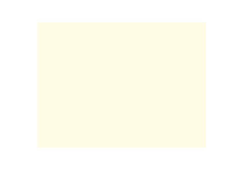
After the rectangle is made, we need to color it. Choose the color you want to use, it can be any color you like. I’m going for a light color to show the grainy effect better. fffcdd is the hex code for the color I am using.
Make a copy of the shape
After we are done with the rectangle, we need to make another identical rectangle that sits right on top of it. In case you make another shape, make the exact copy of it. This will be used as the mask layer.
To make the copy, you can either press the “alt” or “option” key and then click on the shape and drag it. But for this purpose, I’d recommend clicking on the shape, pressing “Command/Control + C”. What this does is make a copy of the shape that was selected. Then press “Command/Control + F”. This places the copy on top of the original shape.
Quick tip – Command/ Control + C makes a copy. Pressing Command/Control + F will place it in front. Command/Control + B places it on the back.
Coloring the copied shape
The copied shape (which is identical) has been placed on top of the original shape. Now we need to give different colors to this shape. We will use a darker shade of the original color as it makes the grain effect come out well and it blends properly. But you can go for other colors as well. The other color that you choose will act as the noise,. so choose colors that go well together.

After changing the color of the copied shape, click on the shape to select it. It’s time for making the mask. The hex color code for the other shape is ead788
Making the mask
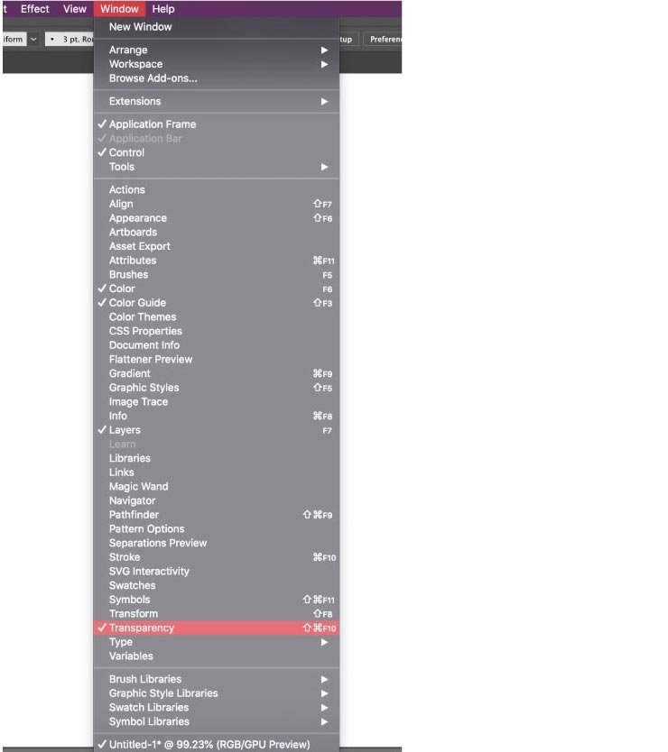
With the copy layer selected, we need to look into the transparency panel at the right side of the Illustrator panel. If you do not see the panel, don’t worry. It can be summoned by a few clicks.
From the Window panel, as shown in the image, select the transparency panel. You’ll see a section that looks like the image shown.
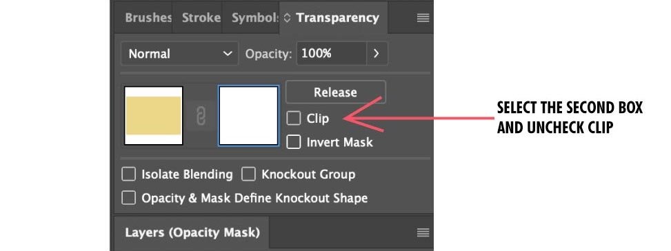
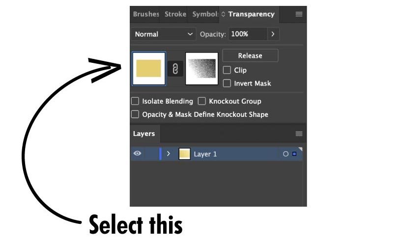
Click on the make mask option after you have selected the copied shape. You’ll see the other window opens up and it is black. Uncheck the clip and inverted mask options. You’ll notice that the second window will turn white. Look at the image for reference.
Click on the white box and select it. Now go back to your shape. Select the rectangle maker from the toolbox or just press “M” on your keyboard. Make a rectangle that covers the entire shape. You’ll see that the new shape is transparent. This means we are going right.

Note – This rectangle shape is for making the noise effect. The shape of this element does not matter, what matters is that the shape should cover the entire copied shape. This transparent “mask” shape will only affect the shape you selected, in this case, the rectangle.
Articles related to Illustrator tutorial:
- Illustrator typography trick to make great text effects
- How to use clipping mask with Adobe Illustrator
- How to crop in Adobe Illustrator
Make the gradient
With the transparent mask selected, press on the gradient button as shown in the image. Just use black and white for the gradient. You can adjust the amount and area of the gradient later.

The gradient is used to make the noise gradually decrease. This is what gives the shape a shaded appearance. Once turned into the gradient, you’ll see the gradient in the transparency panel as well. Now let’s move to the core part; making the grain.
Adding grain texture to the shape
With the transparency mask selected, selected the “Effect” options as shown in the image. Follow this then; Effect >> Texture >> Grain.

You’ll be taken into the grain pattern with two sliders in your view. The intensity and contrast can be adjusted to make the grain look the way you want it. Select the grain type to “stippled” as that makes the effect pronounced.
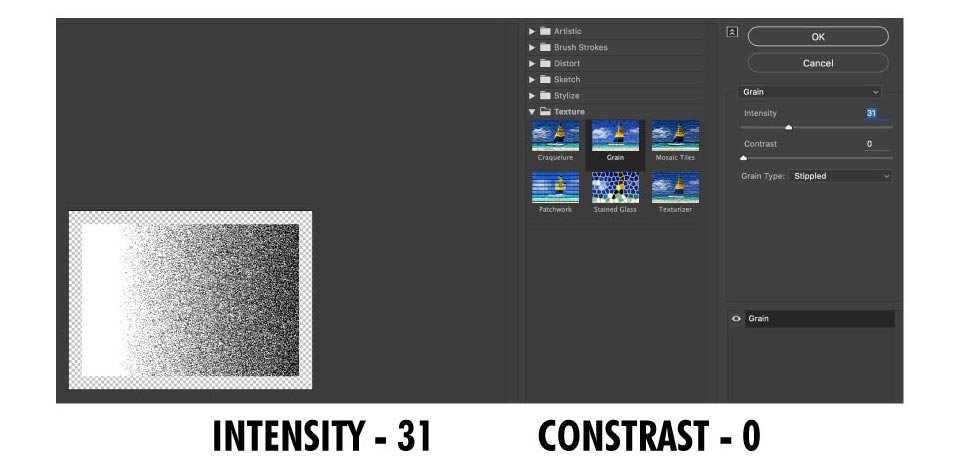
You can play around with the sliders to make the effect to your liking. This is what I have chosen; Intensity 31, contrast 0. Press OK.
Adjusting the gradient
After pressing OK, you’ll see the effect added to the shape. Now press “G” and you’ll see the gradient slider. Adjust the place of the gradient effect and the amount of gradient to adjust the noise. Do this until you are satisfied with the results.
After you are done with it, press the “selection” tool or “V” and the place on the artboard. Then, on the transparency panel, select the colored shape (the original shape). Select both the mask layer and the original layer and group them. And you are done.
Using grain on spheres
The process of making this grain effect for a sphere is exactly like the one for rectangle or any other shape. The place where the difference occurs is the gradient pattern.

After you have applied the mask layer and pressed on the gradient icon, you get into the gradient panel to choose the type of gradient you need.
Instead of the default “linear” gradient pattern, switch it to “radial” to make it suitable for spheres. Once you have that, apply grain and then adjust the grain pattern to give it the shaded effect. It is very simple and once you are familiar with the process, start tweaking a few things to get unique results.
Using a different color will create grains made of a different color. I go for Colorhunt So it is implicative that you must use color combinations that fit well with each other. So go ahead, create your own, unique type of grain effect, and add dimension to your vector illustrations.